Meytal Dahan

Turning your generated AI Design into unique, complex systems

“Our approach starts with structure. Before pixels, we map information architecture, user roles and decision flows — because in a data-heavy product, the hardest design problem is almost never visual.”

— Meytal Dahan

Trusted by teams at

  • BlackSwan logo
    BlackSwan
  • Shibolet & Co. logo
    Shibolet & Co.
  • Menora logo
    Menora
  • Zammit logo
    Zammit
  • Beta Pharmacy logo
    Beta Pharmacy
  • Shomrat Hazorea logo
    Shomrat Hazorea
  • Ministry of Defense logo
    Ministry of Defense
  • Begin Heritage Center logo
    Begin Heritage Center
  • Ichilov logo
    Ichilov
  • Beehive logo
    Beehive
  • Hacker U logo
    Hacker U
  • code-oasis logo
    code-oasis
  • Worx logo
    Worx
  • Migdal logo
    Migdal
  • Nitzat HaDuvdevan logo
    Nitzat HaDuvdevan
  • UTI logo
    UTI
  • Balamunth logo
    Balamunth
  • Cellcom logo
    Cellcom
  • Weizmann Institute logo
    Weizmann Institute
  • Strauss Water logo
    Strauss Water
  • Cura9 logo
    Cura9
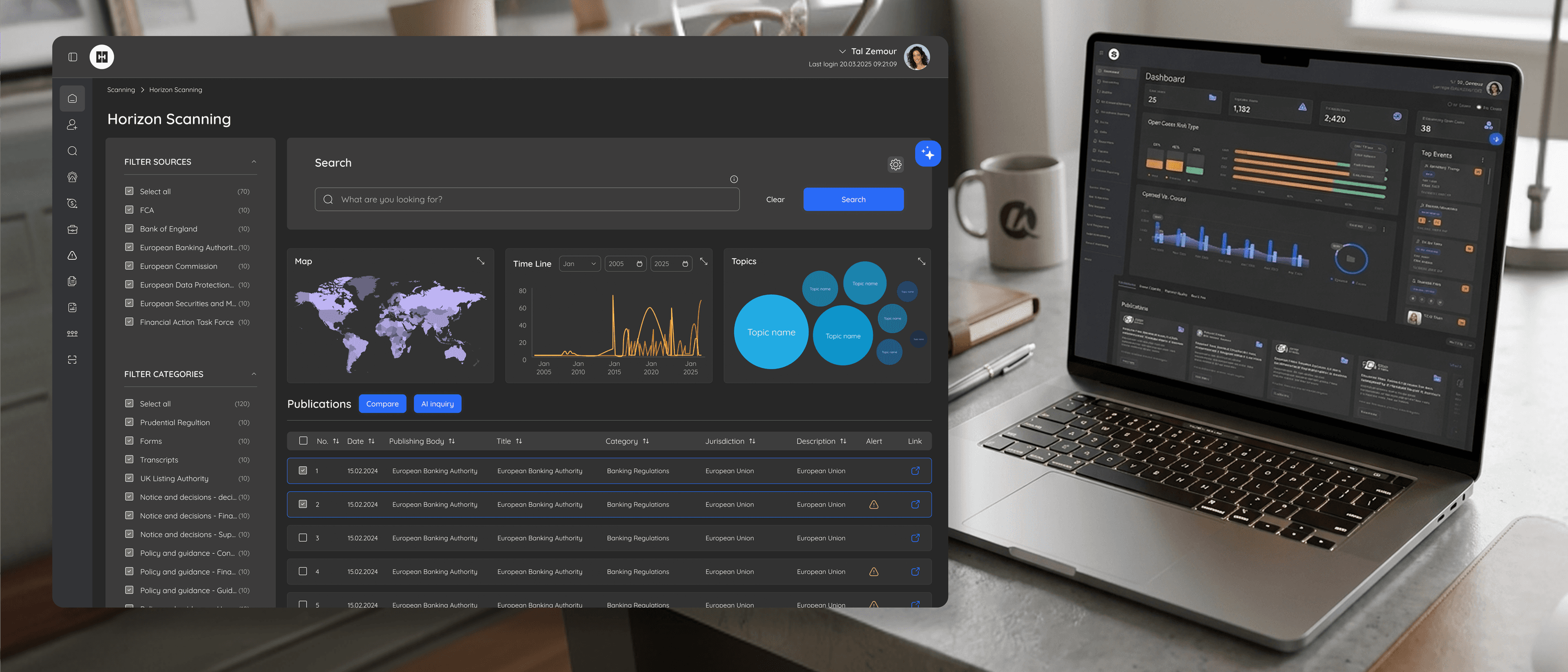
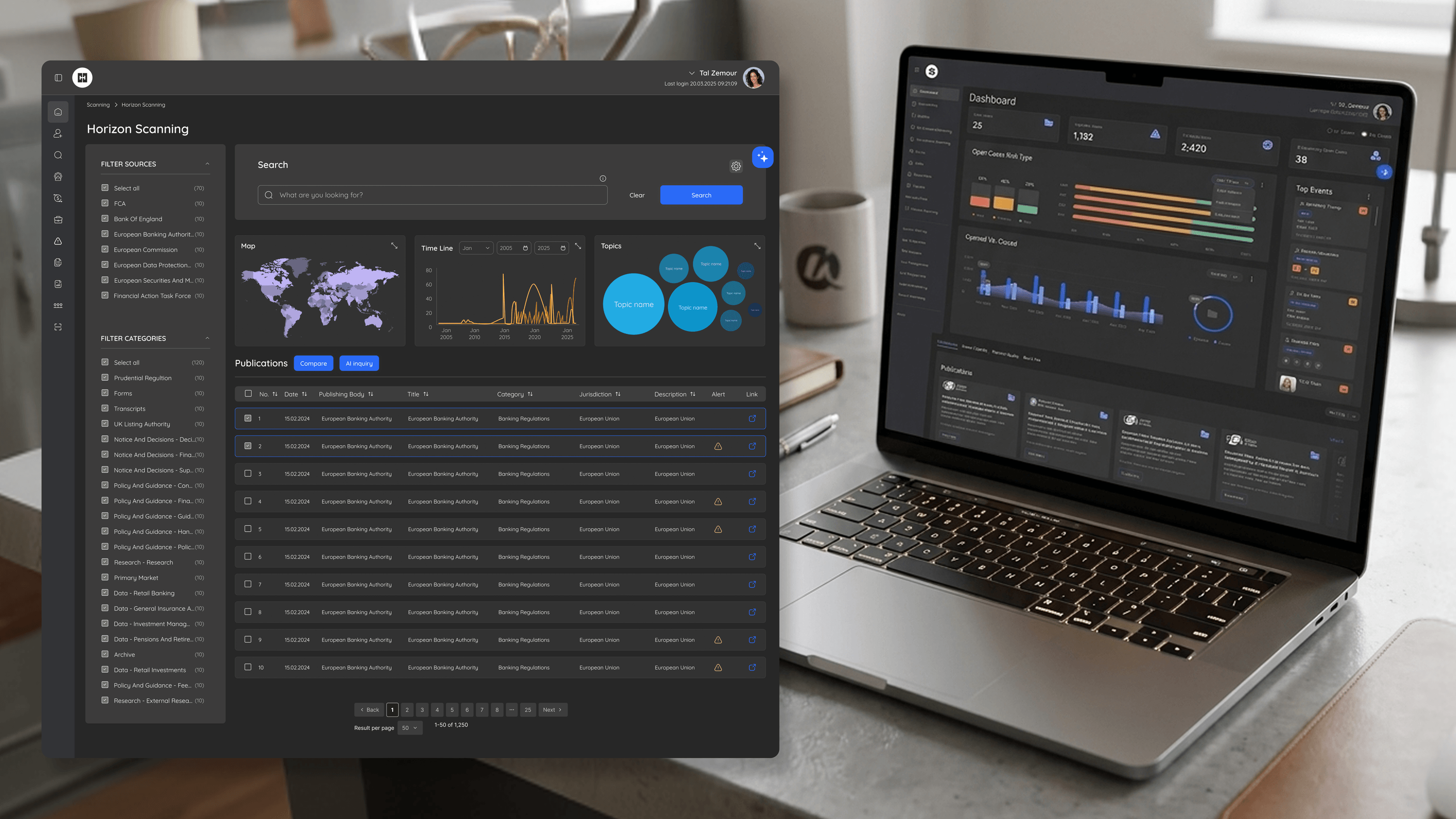
BlackSwan - Designed the Risk Engine - the platform's most complex surface, where all system logic and high-risk thresholds are defined - into a visual decision system compliance teams could actually own.

FinTech & RegTech

BlackSwan - Use Case

Designed the Risk Engine - the platform's most complex surface, where all system logic and high-risk thresholds are defined - into a visual decision system compliance teams could actually own.

What I do best

Making the dense, complex layers of software feel obvious — for the experts who live inside them every day.

  1. 01

    UX Strategy & Flow

    Converting intricate concepts into navigable user experiences aligned with business needs. Information architecture, user roles, decision flows.

  2. 02

    UI Design for Web & Mobile

    Accessible, responsive interfaces optimized across platforms. Design systems that scale from configurator screens to executive dashboards.

  3. 03

    Interactive Prototyping

    Production-fidelity Figma prototypes to validate flows, test concepts and align teams before engineering invests.

  4. 04

    Complex System Design

    Multi-surface products where the data is rich, users are expert, and the interface has to disappear into the work - risk engines, legal portals, manufacturing tools.

Testimonials

Working with Meytal was one of those rare collaborations where everything simply clicks - strategic thinking, high-level visual execution, smooth communication, and endless patience. She has a gift for taking complex ideas and turning them into clear, precise, user-focused experiences, while maintaining sharp attention to detail throughout the process. Beyond her impressive design skills, she's a joy to work with.

Moran Feldman

Project: Menora Insurance

Meytal Dahan

About

Making complicated into easy for users.

Senior product designer with a decade of work across complex systems - financial risk platforms, legal operations, healthcare apps, manufacturing tooling and insurance portals. The common thread is depth: products where the data is rich, the users are expert, and the interface has to disappear into the work.

Insights

Writing on product design.

View all insights
Hacker U
Engineering LeadersR&D Collaboration

A Modular Design System R&D Could Actually Build

Designers can hand R&D a beautiful comp that's a nightmare to build. On HackerU I tried to do the opposite. The marketing site — personalized homepage, dense course pages, a placement page — runs on one modular design system designed to be implemented, not just admired. Reusable, composable components with consistent states mean engineers stop re-solving the same layout on every page. The adaptive homepage card is one pattern, not five bespoke pages. A design system earns its keep when it makes the front end cheaper to maintain, not just nicer to look at.

Read
BlackSwan
Engineering LeadersDesign Systems

A Design System That Earns Its Keep in a Risk Platform

A design system on a banking risk platform isn't about pretty buttons. It's a contract between design and engineering. On BlackSwan, one shared library powered five surfaces — triage, entity mapping, dashboard, horizon scanning, the risk engine — built solo. The win for the CTO: change a threshold display once, it propagates everywhere, and it's defensible in an audit. Consistency without coordination overhead is the cheapest velocity you'll ever buy.

Read
Shomrat Hazorea
Engineering LeadersIndustry-Specific Accessibility

Accessibility When the Product Is a Sofa You Can't Touch

Accessibility on a furniture platform has a trap specific to the industry: we sell with sensory richness — in-home video, fabrics, color, a configuration drill-down down to the foam in a pillow. The more immersive that gets, the easier it is to quietly exclude people who can't consume it visually. So our brief wasn't generic WCAG compliance. It was: every visual decision needs a real non-visual equivalent. Swatches need names and state, not just hue. A live results feed that updates silently is invisible to a screen reader. Accessibility is a parallel interaction contract — not a CSS pass at the end. Especially when the product is a sofa you can't touch.

Read
Shibolet & Co.
Engineering LeadersProject-Specific Data Visualization

Visualizing a Community, Not a Dashboard

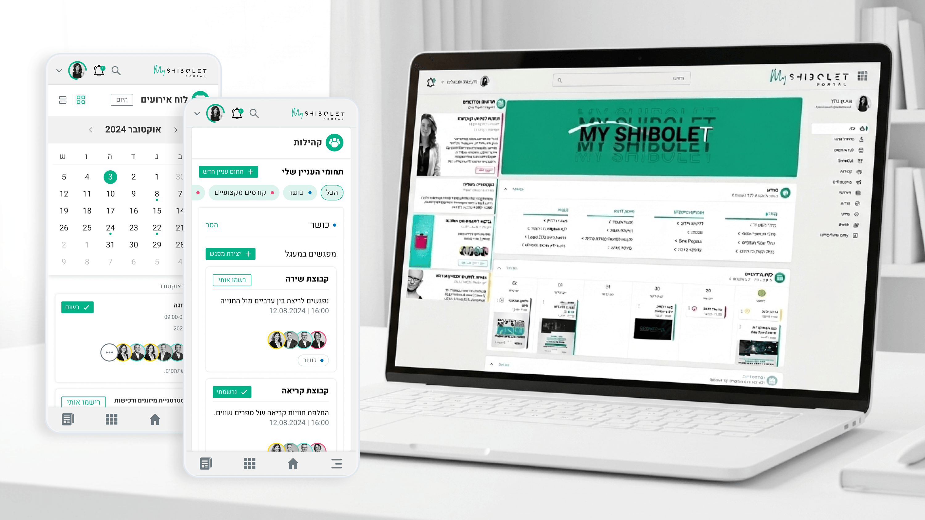
Say data visualization to engineers and they picture analytics dashboards. Shibolet's internal community hub needed the opposite. It was a community hub for a law firm, not an admin reporting tool. The job was making events, courses, benefits, and interest groups scannable and inviting, with light cues like who's attending or active. No charting engine, no KPI grid. Project-specific data viz means the representation answers this domain's real question. Here it was always: what's happening in my community, and what's for me?

Read
Marketing & Campaign Analytics
Product ManagersUser Research

Researching the Marketer, Not Just the Metric

In analytics products, users don't want data. They want to know if it's working and what to do next. Every time I run discovery for a marketing dashboard, the same thing surfaces: people get raw numbers before meaning, so they burn energy interpreting instead of acting. That single insight reframes the roadmap, from "more charts" to "faster decisions." Research isn't a quote deck. It's the thing that tells your PM what NOT to build.

Read
Enterprise Mobile
Engineering LeadersIndustry-Specific Accessibility

Accessibility in the Field Means Gloves, Glare, and One Free Hand

WCAG is the floor for frontline apps, not the ceiling. The real accessibility test is the field: gloves that defeat small tap targets, sunlight that erases low-contrast text, one free hand on a noisy loading dock. Situational and permanent disability collapse into the same requirements out there. Big targets, glare-proof contrast, camera/QR over forms, a single confirming tap. Bonus for R&D: fewer input errors at the source means cleaner data into payroll. Design for the glove and the glare — you'll clear WCAG along the way.

Read
Zammit
Project ManagersUsability Testing

Testing a Spatial Configurator Without CAD

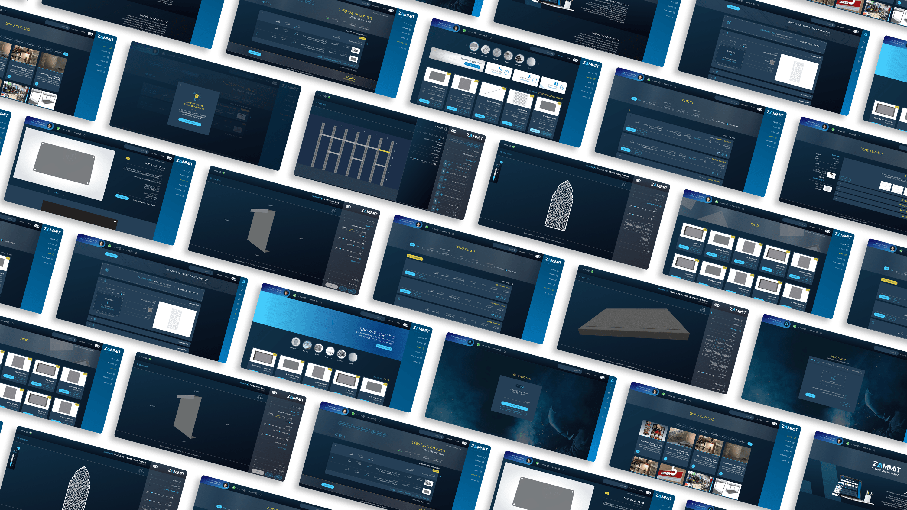
On Zammit's shelving configurator, we asked people to lay out custom shelving — dimensions, shelf count, depth, placement — with zero CAD knowledge. That is a usability risk you cannot hand-wave. So I ran testing as a recurring checkpoint tied to delivery milestones, not a one-off before launch. The payoff is for project managers as much as designers: testing turns a scary, vague risk ('can buyers do this without a salesperson?') into specific, scheduled, fixable issues. And inside an engine with real constraints, testing early tells you which problems are worth engineering time and which a better sequence solves for free. Predictability beats surprises.

Read
Ministry of Defense
Engineering LeadersR&D Collaboration

Designing a public face for serious engineering

The MoD public portal tells citizens about real strategic and security advancements - so the collaboration that mattered most was with the technical side that owns the substance. My constraint as a designer: present serious work credibly, never overclaim it. R&D partners weren't a sign-off gate; they were the source of truth for what 'forward-thinking' could honestly say. The win wasn't agreed pixels - it was a shared standard for representing rigorous work publicly without distortion. Fidelity to the truth is a design requirement, not just an engineering one.

Read
Movement
Studio & Agency

Augmenting Your Outsourced Workforce for HealthTech Projects: Expert Support for Studios With No Medical Background

Studio leaders, a HealthTech project can look intimidating – medical regulation, terminology, doctors. But it's also a market with big budgets. My experience with Ichilov's Movement app lets me come in Plug & Play – to communicate with doctors, document medical edge cases, and deliver ready-made outputs to your studio. Don't pass up the project – bring in an expert.

Read
Menora Insurance
Engineering LeadersIndustry-Specific Accessibility

Accessibility in Field-Dense Insurance Flows

Most accessibility talk stops at contrast on landing pages. In insurance, the hard surface is the field-dense internal tool. On Menora's agent zone — many fields, conditional rules, five role lenses — WCAG means keyboard order through multi-axis filters, screen-reader announcements as conditional fields appear, focus that survives constant state changes. That's architecture, not a finishing pass. The deepest a11y debt hides in the internal tools everyone assumes are 'just for power users.'

Read
Academic & Research Systems
Engineering LeadersR&D Collaboration

Designing Data-Heavy Tools Alongside R&D

In data-heavy research tools, the design IS the architecture. A filter that's trivial in Figma can be a query that melts your backend. I bring engineering in before I sketch: what's cheap to query, what's expensive, where we virtualize. For expert users on huge datasets, speed isn't polish. It's the feature.

Read
Beehive
Product ManagersTypography & Visual Hierarchy

Typography Is How Beehive Decides What You Read First

Beehive's product page had to make complex financial services approachable. My main tool wasn't copy — it was typography. A type scale where every step earns its size, so the eye travels from promise to detail in the right order. For PMs: hierarchy is conversion infrastructure. Decide what the user reads in their first three seconds, or the layout decides for you — usually badly.

Read
Government & Public Sector
FoundersFrom MVP to Full Version

Why GovTech MVPs Don't Look Like Startup MVPs

Founders are taught to ship the scrappiest MVP and iterate in public. In govtech, that instinct can sink you. A citizen service that looks like a beta — or breaks for a screen reader user — loses trust you may never win back. So I redefine 'minimum': not a thin slice of everything, but one complete, accessible, end-to-end path a real person can finish with dignity. Narrow the use cases brutally. Never narrow the quality. Then grow in concentric circles — keep the simple core intact, layer depth around it. Your launch version should be something you'd defend in a public hearing. That's the bar.

Read
Hacker U
Project Managers

Backlog Prioritization in an EdTech System: How Do You Run a Project That Serves Thousands of Users Simultaneously?

Project managers in EdTech: is your backlog exploding because you're trying to serve students, instructors, and marketing all at once? In the Hacker U project we built a dual-impact matrix: recruitment versus Retention. Only features that contributed to both earned priority. 3-week Sprints with clear metrics - that's your number one guardian of the Gantt chart.

Read
BlackSwan
Studio & Agency

FinTech Expertise as Part of Your Existing Team: A Plug-and-Play Solution for Core Systems

Studio leaders, a complex FinTech or cyber project just landed on your desk and you don't have a free senior who knows the domain? Instead of panicking or hiring, you can work on a Contractor model. That's exactly how I joined BlackSwan's Risk Engine project — zero growing pains, maximum expertise from day one.

Read
Shomrat Hazorea
Studio & Agency

Enterprise-Grade E-Commerce Projects: Why Your Studio Needs an Expert in Complex Configurators

Studio leaders: an e-commerce project for a large retail chain is a golden opportunity — but it demands expertise in product configurators and enterprise-grade commerce logic. My experience on the Shomrat Hazorea platform lets your studio present a "seal of approval" and close large projects without the learning curve.

Read
Shibolet & Co.
Project Managers

Running a Digital Project in a Legal Organization: How Do You Hit Deadlines When Partners' Time Is Worth Gold?

Project Managers in legal organizations — your biggest pain point is the billable hours of your partners. On the Shibolet & Co. project we developed a "Batched Approvals" method paired with Figma prototypes: every decision is presented with 3 clear alternatives, and a partner can sign off in 15 minutes instead of an hour. That's how you protect the Gantt and the budget.

Read
Marketing & Campaign Analytics
Engineering Leaders

Data Visualization in MarTech: How Do You Design Charts That Don't Collapse Under Massive Data?

Engineering leaders on MarTech systems: dashboards with real-time visualizations are a performance nightmare. In our campaign management system project we built "Skeleton Loading" — every chart loads separately, a fast experience even under load. Every visualization passed through a "Performance Impact" filter. Design + performance = a system that works in production.

Read
Enterprise Mobile
CEOsSpecific Feature ROI

The ROI Hides in the Feature Nobody Mandated

CEOs often ask me to justify a B2E feature in isolation. Wrong frame. The mandated features get compliance, not adoption. The feature that gives the field worker something back — offline schedules, a camera report that kills minutes of typing, a payslip without a call to HR — is what makes them open the app at all. And once they open it, your mandated workflows finally get used. Don't price a feature by its own ROI. Price the adoption it unlocks across the whole product.

Read
Zammit
Product ManagersMicro-interactions & Animation

Micro-interactions That Made an Engine's Rules Feel Like Feedback

Rule-heavy configurators feel like the system is fighting you — unless feedback shows why. On Zammit, micro-interactions turned the engine's logic into a conversation: a value recalculating, the summary shifting, an invalid option visibly settling out of reach instead of vanishing. PMs, the test for every animation: does it explain the system's behavior, or just decorate it? Only the former protects flow completion.

Read
Ministry of Defense
Product ManagersUser Research

Researching a portal that speaks to a whole nation

On the Israel MoD public portal, the research question wasn't 'who is the user' - it was 'who are ALL of them, and where do their needs collide.' Citizens, partners, press, one set of pages. The instinct to pick one persona and optimize would have broken trust with the others. We researched by intent, not demographics. The real deliverable wasn't insights - it was a model that let the roadmap say no with confidence. Research earns its keep when it makes prioritization defensible, not just informed.

Read
Movement
CEOsSpecific Feature ROI

What One Glance-able Dashboard Actually Returns

The dashboard in Movement (Ichilov's corporate checkup app) wasn't a 'nice to have' — it was the business case. In a B2B2C benefit, a product nobody reopens isn't a benefit, it's a cost that gets cut at renewal. So I designed the home screen to answer one question on open: where am I in my care right now? Purchased checkups, next appointment, latest measurements, recent results. The most expensive feature isn't the complex one — it's the one that drives downloads but no return visits, because you pay acquisition twice. Retention is the ROI. Design for the moment of reassurance, not screen time.

Read
Menora Insurance
Project ManagersDocumentation & Organizational Handoff

Documentation That Outlives the Engagement

As an outsource designer on Menora, I knew I'd eventually leave. So I documented for the people who'd stay. Not pretty specs — the reasoning. Why a field appears for an underwriter but not a team lead. Why the fee flow's rules are shaped the way they are. For a PMO: with outside contributors, documentation isn't admin. It's how the work becomes something the organization actually owns.

Read
Academic & Research Systems
Project ManagersDocumentation & Organizational Handoff

Documentation That Outlives the Project

The biggest project risk is the rationale that leaves with the person who had it. In research tools, half the decisions encode domain logic, why a filter defaults this way, why a workflow matches how scientists reason. Document the why, not just the what, and keep it where people work. That's the difference between a project and a product that outlives its team.

Read
Beehive
Project ManagersDocumentation & Organizational Handoff

What Beehive Needed After I Left the Room

A brand is only worth what survives after the designer leaves. Beehive will keep growing — new pages, more in the client Personal Zone — mostly without me. So I documented decisions, not just files: how charcoal-and-gold is applied, when the logo is used, the tone that keeps finance approachable. For a PMO, that's how you close a project cleanly and kill key-person risk. The real deliverable is a brand the business can run without you.

Read
Government & Public Sector
CEOsPersonalization & Tailored Models

Personalization That Survives Public Scrutiny

When CEOs hear 'personalization' they picture a consumer feed that learns you. In a public service, that's a liability — citizens didn't opt into being profiled, and any hint of differential treatment invites fairness questions you don't want to answer in public. So I reframe it as relevance, not prediction. Not a model guessing what you want — a service showing each person only what actually applies to them, driven by their situation, not surveillance. A parent sees the parent path. Someone who already applied sees status, not a fresh form. That cuts confusion and call volume, and every tailoring decision stays explainable. The efficiency of personalization, without the consumer-playbook downside.

Read
Hacker U
Product Managers

Learning Experience (LX): How Do You Design a Course-Management System That Students Love?

Product managers in EdTech: students aren't rational users - they're human beings on a personal journey of learning and fear of failure. In the Hacker U project we built a Learning Experience with clear progress visualization, milestones, and positive reinforcement at moments of success. UX = LX. Design the journey, not just the screens.

Read
BlackSwan
FoundersColor & Psychology

Color That Signals Trust, Not Alarm

Selling risk software to banks? Your product has three seconds to feel credible — and color is doing that work before anyone reads a word. On BlackSwan I refused to drown the UI in red. If every flag screams danger, severity means nothing. A calm, calibrated palette tells a buyer the tool is in control of the situation. In compliance, that composure IS the pitch.

Read
Shomrat Hazorea
Engineering Leaders

Designing a Configurator With Complex Logic: How Do You Prevent Performance Collapse on 3D Display Screens?

Engineering leaders: product configurators with 3D displays collapse when the designer thinks "what's prettiest" instead of "what's most efficient." In the Shomrat Hazorea project we developed Progressive Loading with a Performance Impact review for every decision. Design + performance from day one = a product that works in production.

Read
Shibolet & Co.
Product ManagersTypography & Visual Hierarchy

Typography as Triage: Ordering a Legal Community Hub

PMs keep asking: how do users know what matters when one screen does five jobs? On Shibolet's internal hub, a single view carried a compliance notice, a new course, a firm event, and a community invite. I didn't solve that with more tabs. I solved it with typography. A deliberate type ramp let official items read with authority and social content stay warm, in the same layout. Visual hierarchy is product triage made visible. Get the type ramp right and you stop negotiating screen real estate per stakeholder.

Read

FAQ

Common questions.

What does Meytal Dahan specialize in?
Meytal is a senior product designer specializing in complex B2B and enterprise systems - data-heavy dashboards, configurators, design systems and role-based interfaces where users are domain experts and the interface has to disappear into the work.
What industries has Meytal worked in?
Across 7+ years she has shipped production work in FinTech and RegTech, LegalTech, HealthTech, EdTech, manufacturing software (configurators), InsurTech, pharmacy retail, e-commerce, government communications and cultural heritage.
Is Meytal available for freelance or contract work?
Yes. Meytal takes on new product design work as an employee, freelancer or contractor, and is comfortable as the solo designer embedded with product and engineering or as lead designer alongside a broader team.
Does Meytal work with startups or enterprise companies?
Both. Her work spans early-stage products like BlackSwan as well as established enterprises and institutions including leading law firms, hospitals and government bodies.
Where is Meytal based and what languages does she work in?
Meytal is based in Rishon LeZion, Israel, works with clients worldwide, and works fluently in English and Hebrew.
What tools does Meytal use?
Figma is her primary design and handoff tool, used at production fidelity. She also works with Claude Design, ChatGPT / Gemini, the Adobe Suite, and Jira / Monday for delivery.

Get in touch

Have a project in mind?

Drop a line. Meytalyav@gmail.com